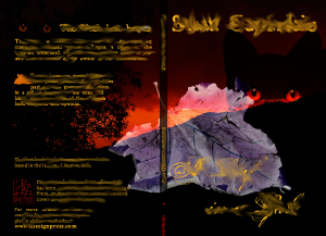
I’ve just finished our second book cover. Whilst the first took some time the second took me only 1 day of actual work (and about 1 day of investigation work). The picture has been smudged to obscure the work-in-progress.
 We’ve sent the book to the printers so we can get a draft. When it comes back in a few days time and if it looks fine then I’ll document the tasks. Personally I’m really pleased about the design when viewed as a PDF, though we haven’t shown this to the author but I’m confident they’ll like the ideas I’ve expressed.
Highlights for this cover are:
- Guides in both GIMP and Scribus are the Createspace template file that is specific for our book size and page count.
- Added 2 other photos from our stock and snapped one extra for the “leaf” that is on the cover (picked a leaf and left it to dry to curl up). Scaled and added using different types of effects to merge. I ended up with 10 layers.
- Boxes added to spine with 80% Normal (i.e. 20% transparency) to make the spine text more readable. You can’t easily use transparency with PDF 1.3 unless you flatten the image so it is easier to flatten in GIMP.
- Three layers added in Scribus. One layer is the background (from GIMP image), one top layer is guide page and one middle layer is text boxes.
- Three new fonts: one from Eduardo Recife (http://www.misprintedtype.com/v4/) and two from Dieter Steffmann (http://www.steffmann.de/ ) : these reflect the period and the content. We’re still investigating the usage rights for these fonts but for Dark and/or Gothic then these look very good. Our interior text remains as GaramondNo8 for readability.
I hope the dark black and red colours come through without problems from the printer because this should look awesome in the flesh.