
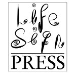
We started designing a logo for Life Sign Press by throwing all the ideas into a pot on the word “Life”, “Sign” and “Press” and came up with a number of designs but in the end they just didn’t work out.
They distracted us from our clients in that our clients are the ones who need the branding and design and we just need a simple recognisable logo – using the same words but with a little bit of twist to make them different.
We had recently discovered the Adobe Air based LiveBrush. It is literally childsplay to use and so our daughter used a graphics tablet to write the “Life” and “Sign” (with an inspiration from the loops in the Tim Burton’s – The Nightmare Before Christmas and the feel of the Playstation3 Little Big Planet but constrained to those two words and in black and white) and then we used GIMP to combine the images into one file and added the word “Press” using Garamond.
Add a border and this is what we ended up with,
Our Logo